Store comparison
The Store Comparison view puts every store side by side on the same chart so you can see who is ahead and where the differences come from. It shows up for owners and for any manager assigned to more than one store. Sales and Net Profit appear only for the stores you have permission to see sales for — a manager without sales access still sees the Expenses comparison.
Open it from the Store Comparison link at the top-right of the main dashboard.
What's on this page
The page stacks two cards, each with its own date range:
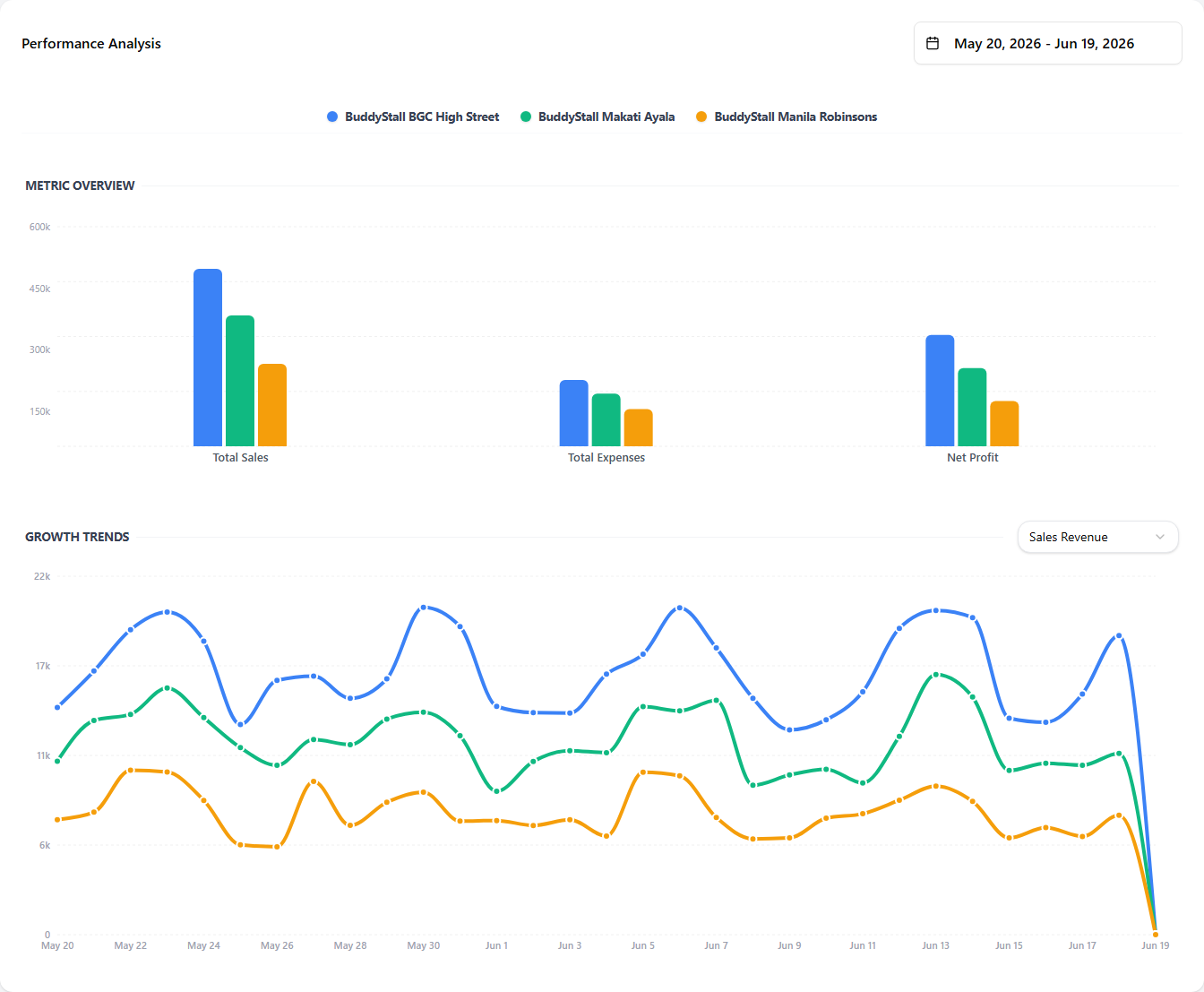
- Performance Analysis — every store on the same axes. A Metric Overview bar chart compares the stores across Total Sales, Total Expenses, and Net Profit at a glance, and a Growth Trends line chart plots one chosen metric over time, one line per store.
- Expenses (by category or item) — every expense category side by side with one bar per store, or drill into a single category and compare up to ten individual expense items across stores.
Every store keeps the same colour on every chart across both cards, so you can follow one store from one view to the next.
Performance Analysis
The first card. One date range at the top-right scopes the whole card, and a store-colour legend runs along the top. Inside it sit two charts: Metric Overview (bars) and Growth Trends (a line).
 1234
12341 Date range — the period being compared. It scopes both charts in this card. Granularity follows the range the same way the main dashboard does — ≤ 31 days plots daily, wider rolls up to monthly.
2 Store legend — one colour per store, reused on every chart on the page so a store stays recognisable everywhere.
3 Metric Overview — grouped bars. There is one group per headline metric — Total Sales, Total Expenses, and Net Profit — and one bar per store inside each group, so you can compare the stores across all three metrics at once.
4 Growth Trends — one line per store over the period, with a metric selector (Sales Revenue / Expenses / Net Profit) that chooses which single metric the lines plot. Useful for spotting a store that is climbing or slipping inside the period the bars summarise.
Expenses by category and item
The second card. A mode toggle switches it between two views — Categories and Items — and the card title changes to match (Expenses by Category / Expenses by Item). It has its own date range, independent of the Performance Analysis card, so you can compare a different window here without disturbing the card above.
In Categories mode, every expense category is laid out as a group of bars — one bar per store inside each group — so you can see, for example, which stores spend the most on Utilities.
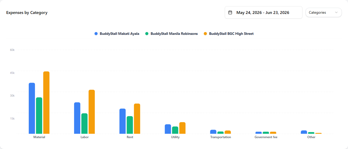 123
1231 Date range — independent from the Performance Analysis card's range, so you can compare a different window here.
2 Mode toggle — switch between Categories and Items. In Items mode a category selector appears next to it.
3 Category groups — each x-axis label is one expense category; the bars inside it are one per store, using the same store colours as the card above.
In Items mode you pick one category, then choose the individual expense items to compare — Rent, Internet, and so on — across stores.
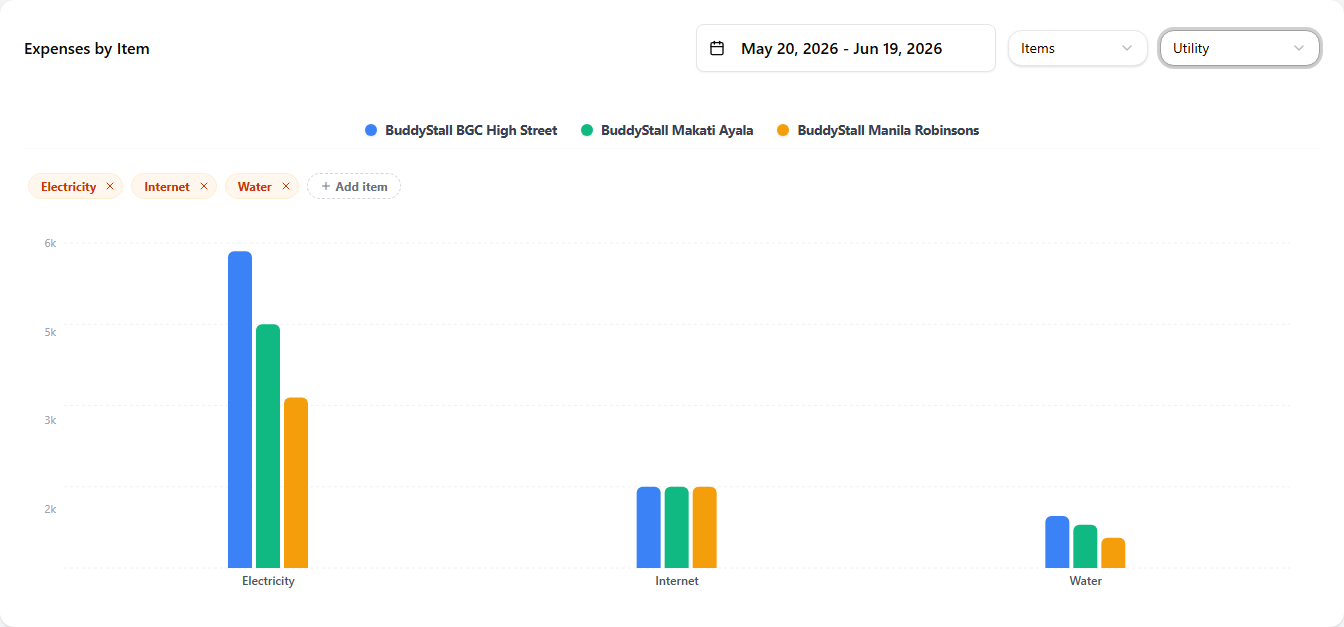 123
1231 Category selector — which category to drill into. The card starts on the top items in that category automatically.
2 Item picker — the items currently in the comparison appear as chips; remove one with its ✕, or use Add item to search the category and add more, up to 10 items at once. Your selection is saved per category in this browser, so the next time you open the same category you see the same items.
3 Item bars — one x-axis label per selected item, with one coloured bar per store inside each — the same store colours used on every chart above.
The item picker remembers what you chose using your browser's local storage. Open the page from a different device or browser and you start fresh.