Reading the dashboard
The dashboard is your owner / manager overview — sales, costs, profit, and the breakdowns behind them. It opens by default after login for owner and manager accounts; staff accounts have no dashboard and go straight to the POS portal.
Owners see every store. Managers see only the stores they are assigned to, and only the metrics their permissions allow (a manager without sales access, for example, sees Total Cost but not Total Sales or Profit).
What's on this page
The dashboard stacks five sections from top to bottom. The store switcher at the top scopes everything below to All stores or a single store.
- Store switcher & comparison link — choose which store(s) the numbers cover, and jump to the cross-store comparison view.
- Performance Overview — totals plus a sales / cost / profit chart for a chosen period, with deltas against the previous equivalent period.
- Sales Distribution — when sales happen, by hour of day or by day of week.
- Sales Composition & Ranking — what sold the most, by product, add-on, or category.
- Expense Composition & Ranking — where the money went, by expense category or by expense item.
Store switcher & store comparison
The top-right of the page has a store switcher. Pick All Stores for a combined view, or any single store to scope every section below to it. Owners with more than one store also see a Store Comparison link here — see Store comparison.
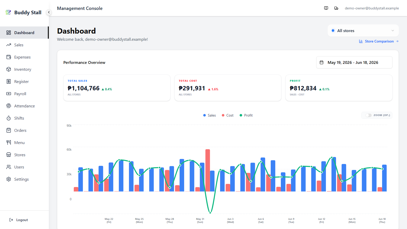
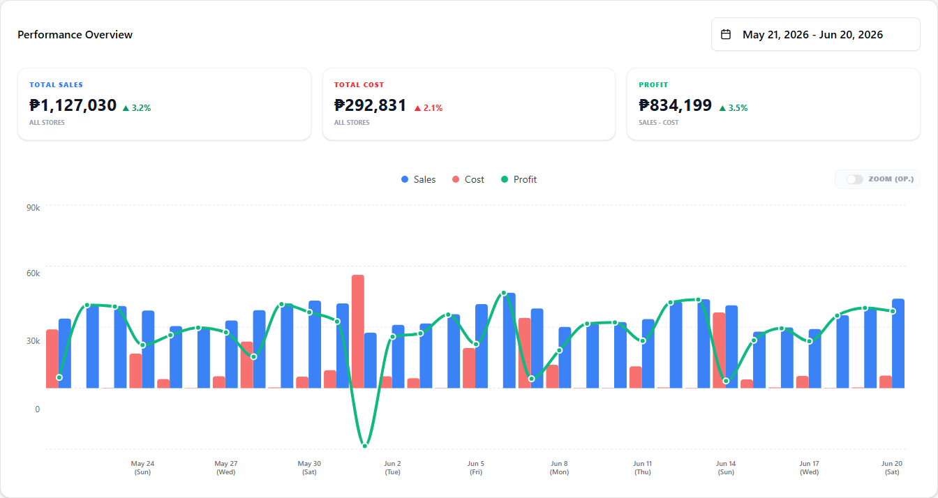
Performance Overview
The first card on the dashboard. It shows headline totals for the selected period and a chart with sales (bars), cost (bars), and profit (line) plotted over time.
 1234
12341 Date range picker — pick any range. The picker also drives the chart's granularity: ranges of 31 days or less plot daily points, anything wider rolls up to monthly.
2 Total Sales / Total Cost / Profit — totals for the selected period. Owners see all three; managers without sales permission see only Total Cost.
3 Delta badge — a coloured percentage next to each total comparing the selected period against the previous equivalent period (same length, immediately before). Green when the direction is good for that metric (sales up, cost down), red when it is bad.
4 Chart — sales and cost as bars, profit as a line. On a daily chart you also get a Zoom (Op.) toggle at the top-right of the chart that crops the Y-axis to magnify operating-level variation.
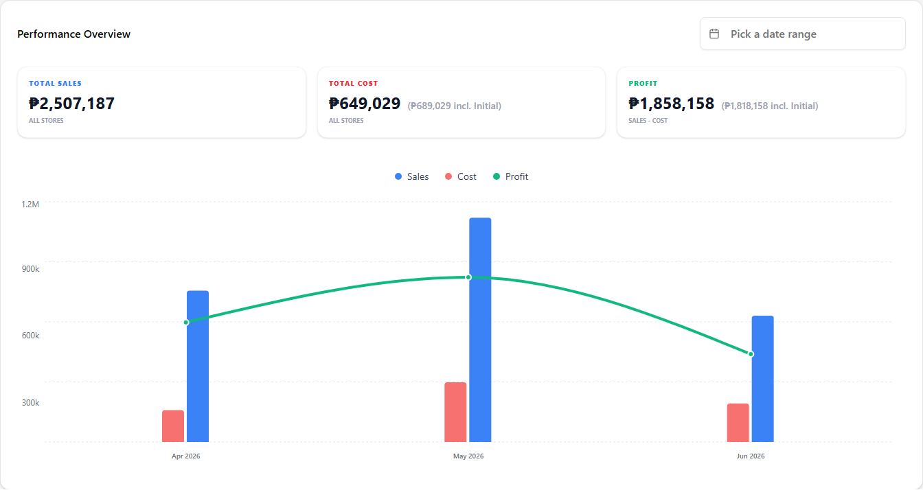
Clear the filter for an all-time view
Clear the date range from the picker and the card shows everything since the business started — all-time totals, and a chart that covers every period with recorded data.
In this all-time view, Total Cost and Profit each show an extra parenthetical figure labelled (incl. Initial):
- Total Cost — the main number stays on operating cost. The parenthetical (₱X incl. Initial) adds the one-off initial investment on top, giving total cost over the lifetime of the business.
- Profit — the main number stays on operating profit (Sales − Operating Cost). The parenthetical (₱X incl. Initial) is the net profit after the initial investment is also subtracted.
The main numbers stay on operating figures so a period view and the all-time view compare like with like; the parenthetical is there so you can see the lifetime picture in the same place.
Initial investment is the one-off setup cost recorded for the business (equipment, deposits, opening stock, etc.) — not part of running costs. It is folded into Total Cost and Profit only in the all-time view, never inside a fixed-period range.
With the date range cleared, Total Cost and Profit each gain the highlighted (₱X incl. Initial) figure:
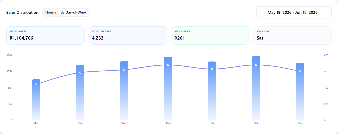
Sales Distribution
A second chart, focused on when sales happen rather than how much.
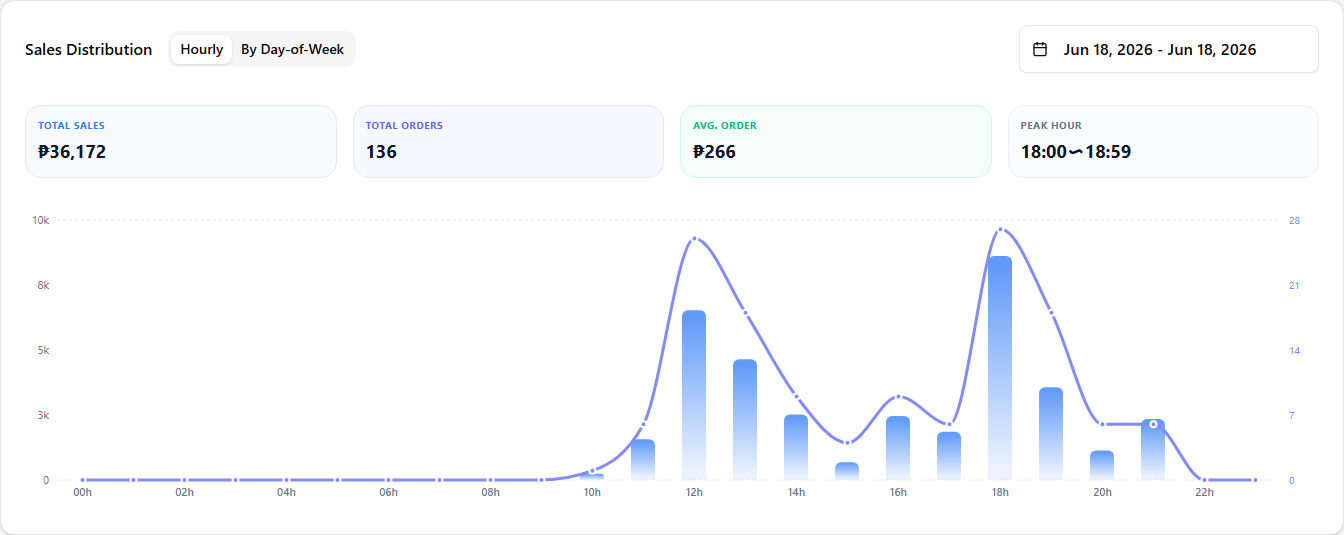 12
121 View tabs — switch between Hourly (sales per hour of the day) and By Day-of-Week (sales per weekday).
2 Date range — the period the distribution covers. Each view has its own sensible default (today for Hourly, the last 30 days for Day-of-Week) until you pick something.
The By Day-of-Week tab sums the same period per weekday instead of per hour, so you can see which days are busiest.
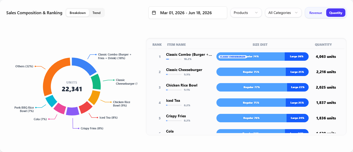
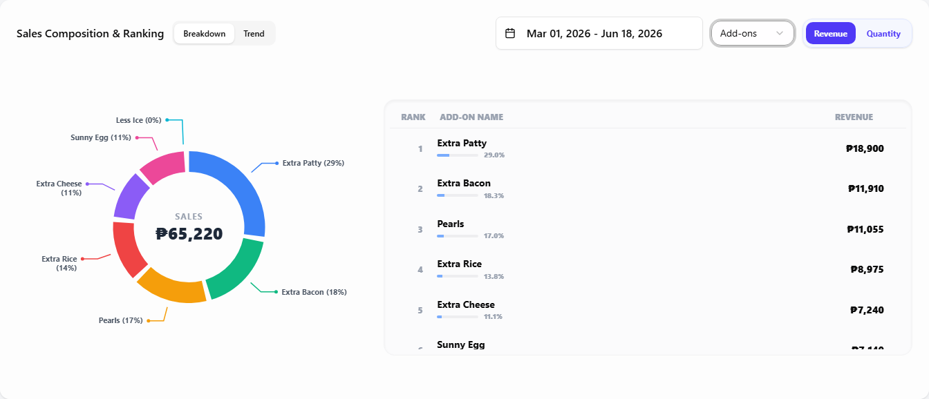
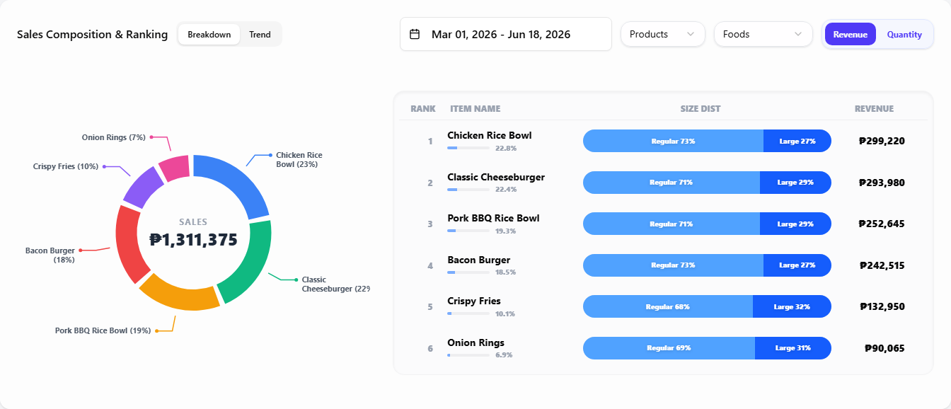
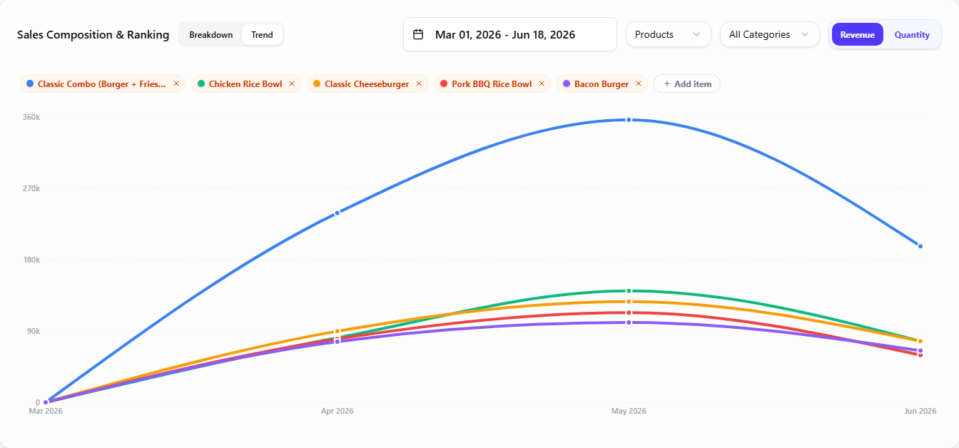
Sales Composition & Ranking
Which items, add-ons, or categories pulled in the revenue.
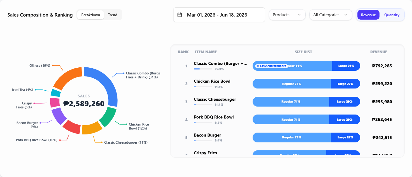 123
1231 View tabs — Breakdown ranks items for the period; Trend plots the top items over time.
2 Filters — date range, mode (Products / Add-ons / Categories), metric (Revenue / Quantity), and a category filter (Products mode only) to narrow the list.
3 Ranking / trend — the ranked list in Breakdown, or one line per item in Trend.
The same Breakdown reshapes as you change the filters. Switch the metric to Quantity to rank by units sold instead of revenue:
Switch the mode to Add-ons to rank add-on options instead of products (add-ons have no size split, so there is no Size Dist column):
Or stay in Products and pick one category to narrow the list — here Foods:
The Trend tab keeps the same filters but plots the data as lines over time instead of a ranked list. In Products mode the top items are pre-selected as chips you can swap or extend (up to 10 lines); Categories mode plots every category automatically. (Add-ons support Breakdown only.)
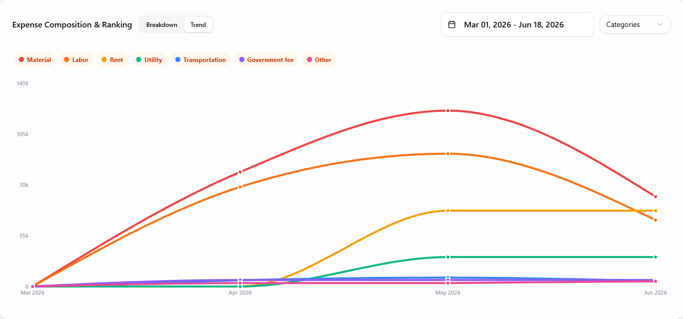
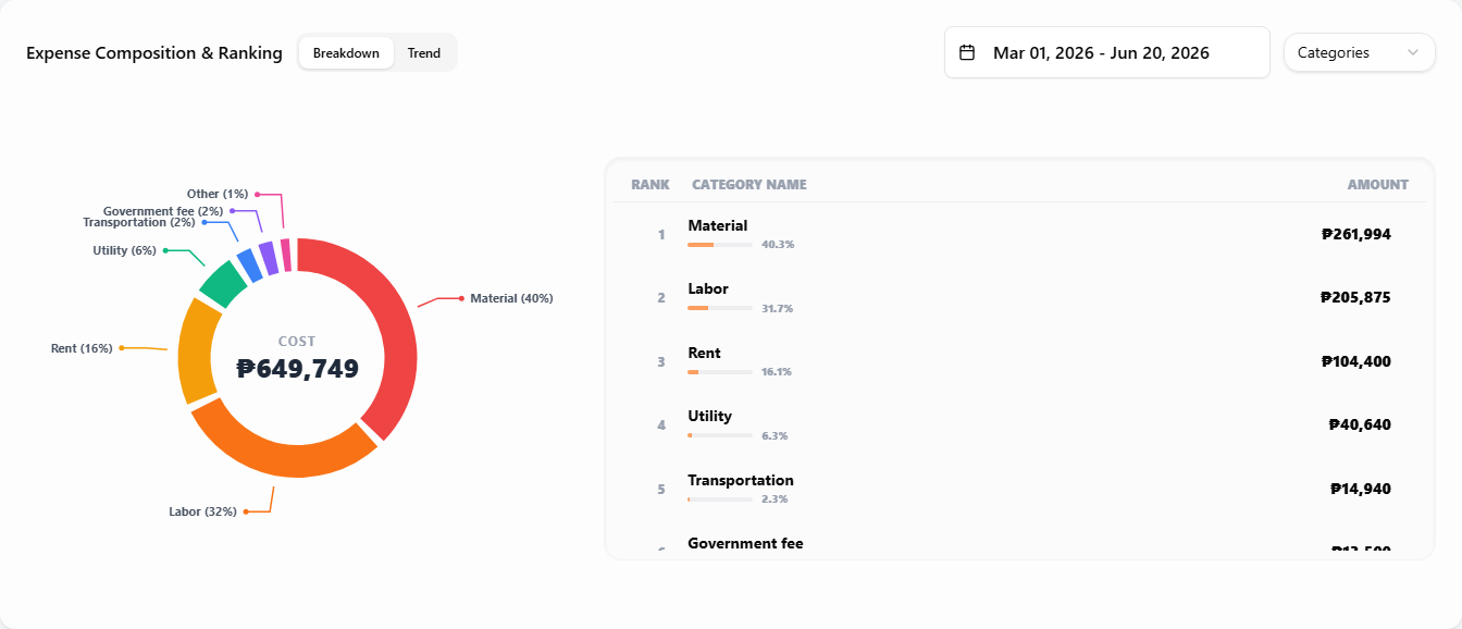
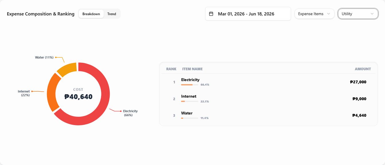
Expense Composition & Ranking
The same pattern as sales, applied to recorded expenses.
 12
121 View tabs — Breakdown ranks expenses for the period; Trend plots them over time.
2 Filters — date range and mode (Categories or Expense Items). The Expense Items mode adds a category filter so you can drill into one category at a time.
In Expense Items mode the category filter narrows the list to a single category — here Utility (Electricity, Internet, Water):
The Trend tab plots expenses as lines over time. Categories mode charts every category automatically; Expense Items mode lets you pick up to 10 items to compare (top items pre-selected, swap them with the chips).