
Sales dashboard
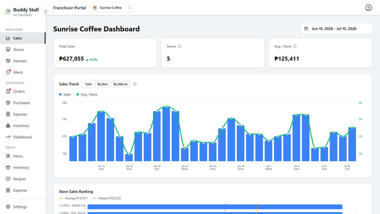
The dashboard is the screen a franchise opens on — and the Sales link in the sidebar brings you back to it from anywhere. It reads net sales across the whole network for the period you choose: brand-wide totals at the top, then a trend chart, a store ranking, and finally a breakdown by franchisee owner and store.
Pick the period
The date range picker sits at the top-right of the page. It defaults to the last month, and every section below follows whatever range you set.
- Granularity is automatic — ranges of 31 days or less plot daily points; anything wider rolls up to monthly.
- Delta badges — the coloured percentages next to totals compare the selected period against the previous equivalent period (same length, immediately before). Green means sales went up.
Totals
Three cards head the page:
- Total Sales — net sales across every store in the franchise for the period, with a delta badge against the previous period.
- Stores — how many stores had sales in the selected period.
- Avg / Store — Total Sales divided by that store count. A store counts in full once it has any sales in the period, even if it sold on only some of the days.
Sales Trend
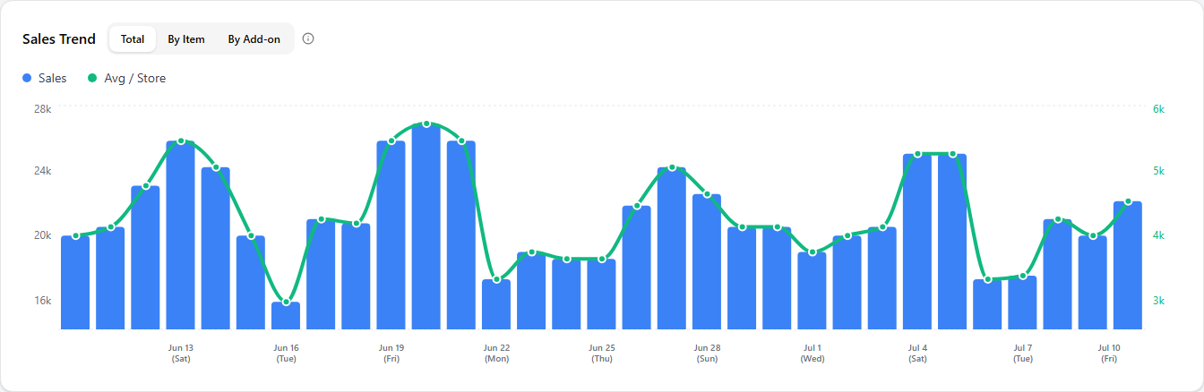
Sales over time for the whole network. Three tabs choose what the chart plots:
- Total — network sales as bars, with an Avg / Store line on its own right-hand axis so you can watch the per-store average move with the total.
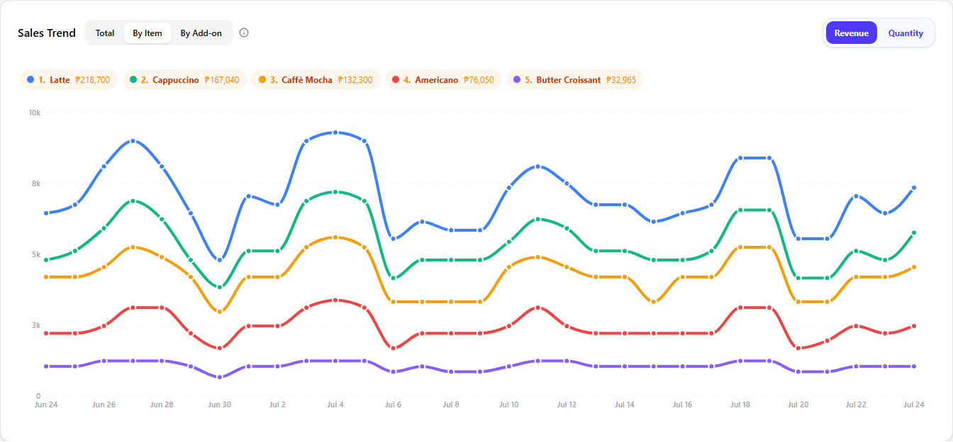
- By Item — one line per menu item. A Revenue / Quantity toggle switches between peso sales and units sold. An item's total includes any add-ons ordered alongside it.
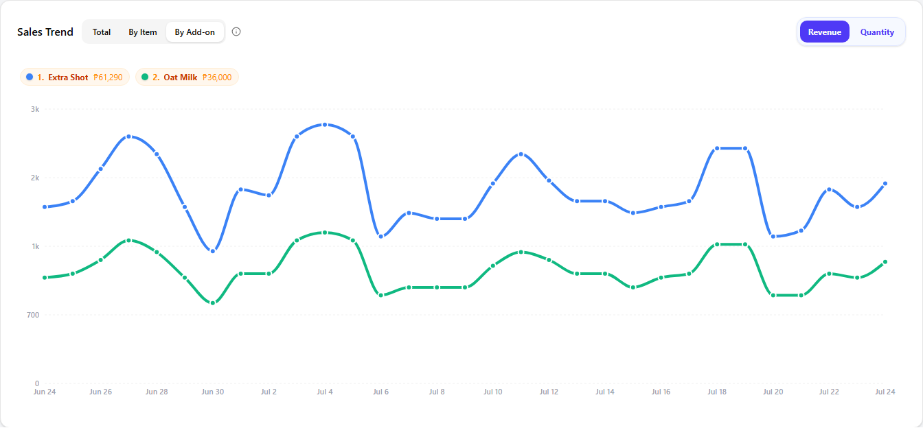
- By Add-on — the same view for add-on options.
On long ranges the chart scrolls horizontally, with the axes pinned so the scales stay readable.
On By Item and By Add-on, a legend above the chart ranks each line by its total for the period — click Revenue or Quantity to switch what that total and the lines measure.
Store Sales Ranking
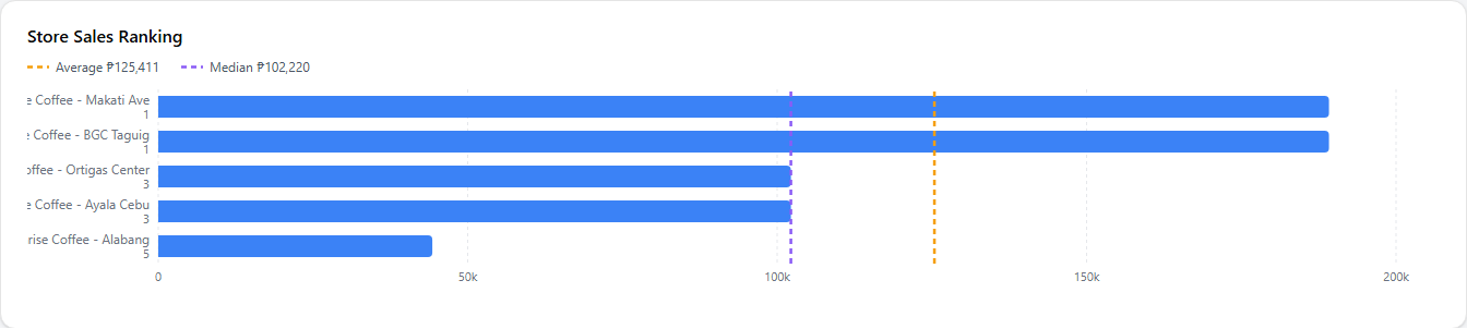
Every store in the franchise ranked by net sales for the period, as a horizontal bar chart. Two dashed reference lines mark the network Average and Median (computed over stores that actually sold), so you can see at a glance who sits above and below the pack. Stores with equal sales share a rank.
With more than ten stores, the chart collapses to the top 5 and bottom 5 with the middle folded away — a Show all button expands the full list.
Owner & store breakdown
The bottom of the page splits the same period's sales by franchisee owner. Each owner gets a card headed by their name and an Owner totals figure with its own delta badge; inside it, one small card per store shows that store's Total Sales and delta.
Store cards are tinted against the franchise average so outliers stand out: green at 105% of the average or above, red at 95% or below, neutral in between.
